


01 - Background:
In December 2021, Xometry acquired Thomasnet to accelerate our growth of marketplace services and scale our business for both our buyers and suppliers. The design team was tasked with integrating the Thomasnet brand into our Xometry system. I worked with both the Product and Marketing design teams to create a seamless integration into our in-house design system called Loft.
02 - The problem:
We’ve just come off a “Xometry 2.0” refresh and a few weeks later we got word of the Thomasnet acquisition. Thomasnet is a legacy company with a rich history dating back to the early 1900s. Many people in the manufacturing world relied upon Thomasnet for their supplier needs and us as a design team was tasked with integrating the brand into our new Xometry 2.0 refresh.

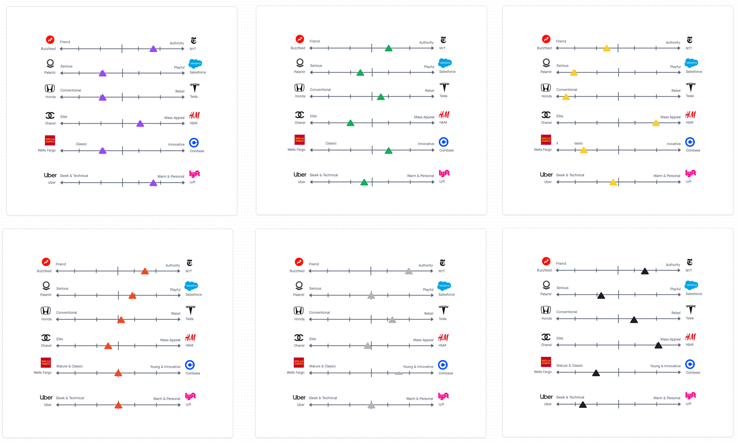
03 - Brand Sliders:
In order to set some foundation for the redesign, we gathered some of our senior stakeholders and ran a brand slider exercise. The decision was to pull Xometry into more of an approachable company but still maintain our professional expertise. We wanted to bring some of that into Thomasnet as well but more on the side of professionalism.

04 - Design Audit and Roadmapping:
Some low-hanging fruit updates were made instantly (like including our Xometry modules across Thomasnet.com) but for the majority of the assets, we took a collective look at different parts of the brand to set up a roadmap of updates we can roll out.


05 - Brainstorming (COLOR-STORMING?)
One of the first challenges to tackle was updating the color palette. We set up a few working sessions to brainstorm how to integrate our existing design system into Thomasnet. One of Thomasnet’s main colors was green but it was not an accessible shade so we first took a stab at different shades and hues to make it AA accessible for screens. We landed on a new green that kept the brand’s identity similar.


The main process revolved around finding a balance in the updated logo. We had already added “A Xometry Company” to the Thomasnet logo to use in the interim while working on updating the brand. We experimented with different colorways to 1) refresh the brand and 2) keep the legacy alive. We collaborated with different designers for feedback and input and finalized the style to the following options:

Spoiler alert: Everyone liked the first one! Thomasnet 2.0 takes shape.


06 - Initial design kick-off
When we talked with stakeholders about what they’d like to see updated about the Thomasnet brand, many replies were in tandem with each other. The top 3 observations:
The current homepage feels so heavy. Can we lighten up the feel?
Our users are ones that have been using the service for years. Can we keep the same functionality but breathe fresh life into the overall UI?
Cross-implement Xometry offerings through Thomasnet.
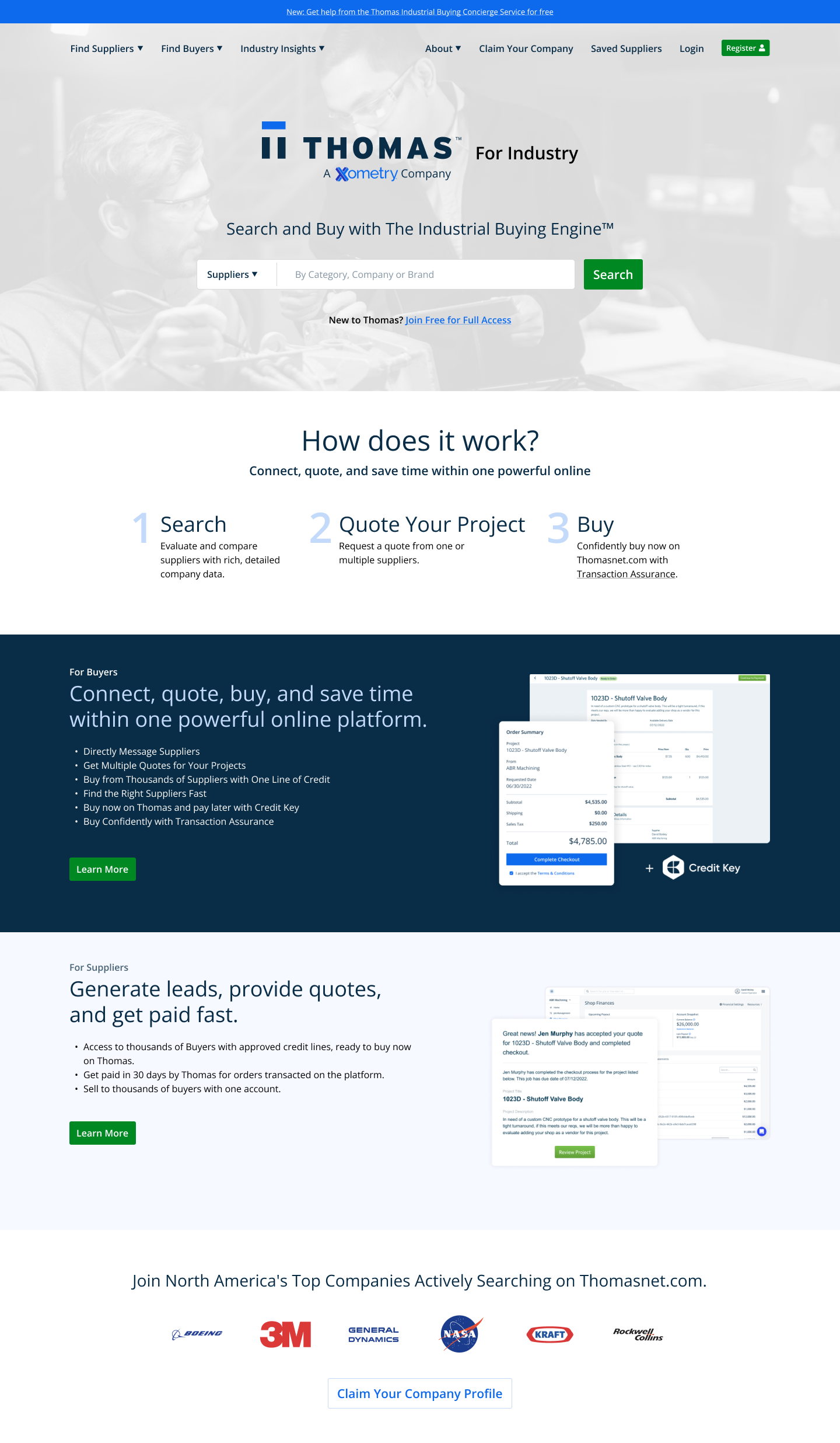
I was the lead designer for updating the home page design. I started with a basic wireframe of what could be the next Thomasnet.com home page.

07 - Web Design (hi-fidelity)
Creating the wireframe set up the basis for the new Thomasnet home page. We had an internal design review of the layout and set up a few areas for improvement.
Make sure the search function is prominent on the page.
Tie in Xometry’s design modules where we can (ie. banners).
Visually clean up the site to so there’s less clutter and more focus on the main objective.
I created the hi-fidelity design using Xometry’s Loft design system and the new Thomasnet 2.0 colors.

08 - the next steps
As mentioned before, this is a larger-scale project with many components to it. Since my design has been well-received, I will set this on the back burner for now and continue the next steps in the scope. Once all the assets have been audited, reviewed, designed, and reviewed again, they will be ready to enter the development phase and be pushed live in the near future.
My next challenge is the email suite. I will be leading the email design updates and hope to have a case study soon on the process. Stay tuned!