In late 2021, our design team overhauled Xometry’s existing brand and created a newer, fresher Xometry 2.0 brand.

01 - Mission
Xometry powers the industries of today and tomorrow by connecting people with big ideas with manufacturers who can bring them to life.
Xometry powers the industries of today and tomorrow. We connect the people with big ideas to the manufacturers who can bring them to life.
Solution-oriented: There is always a path forward. Buzzwords and flowery language aren’t solutions; solutions are solutions.
Understanding: Logos, pathos, ethos; strive for accuracy, speak with sincerity, and hold to a high standard.
Hospitable: Friendly, warm, and inviting; we are relationship builders. Invite people in, and encourage them to stay awhile.
02 - VIsion
Vision: To be the global marketplace – the rails for buyers and the OS for suppliers – for the crucial industrial market.

03 - LOGO
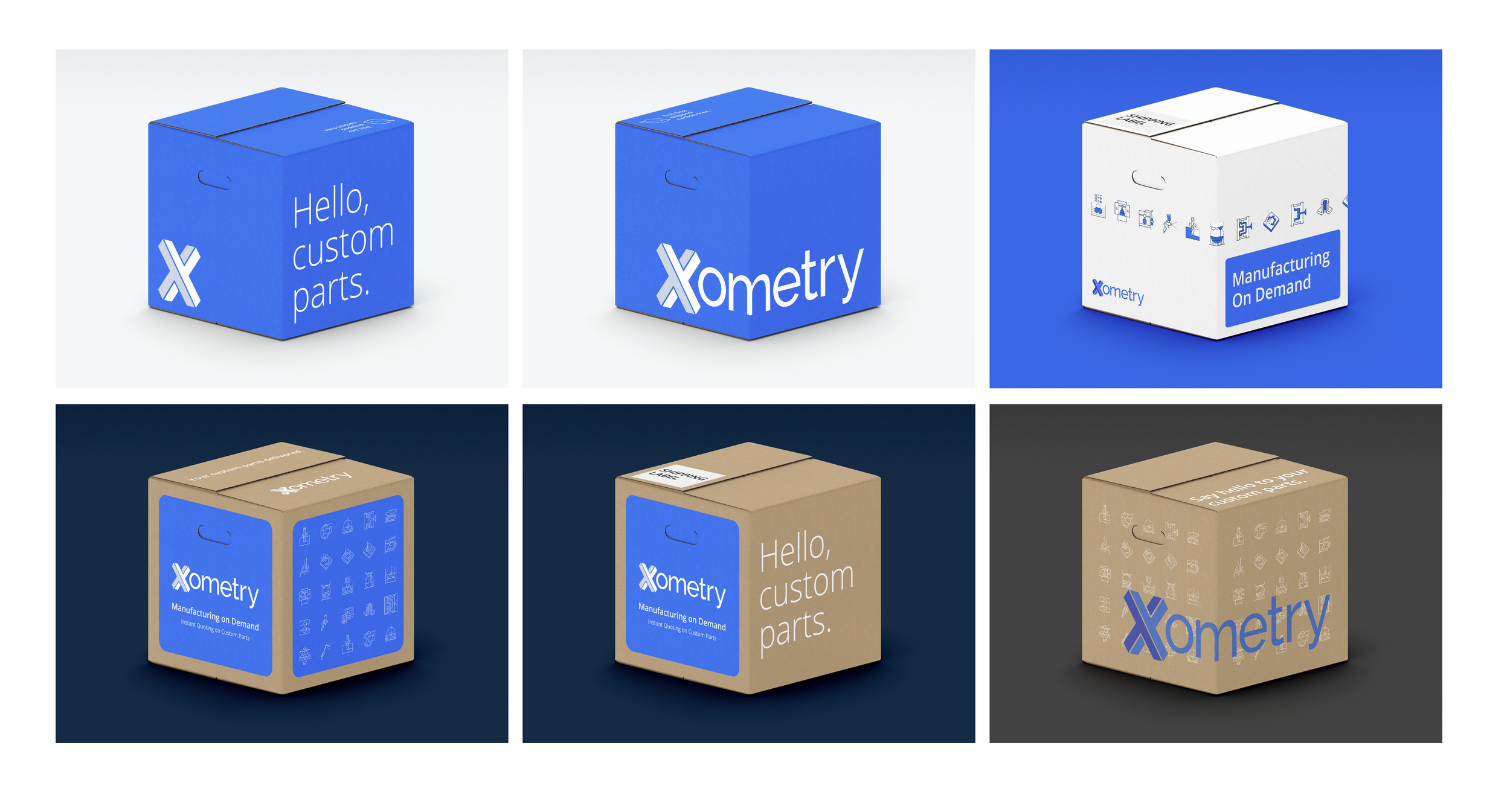
This is the primary logo for Xometry. Its shape, wordmark, and two-tone motif are unchanged from the previous iteration, but its colors have been updated to more striking, vibrant blues.
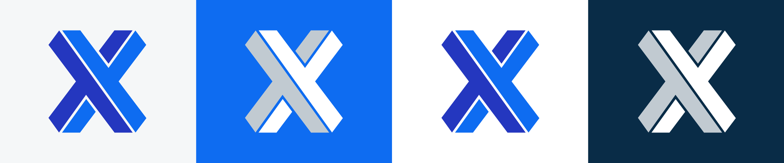
Xometry’s X mark should only be used when the brand needs to be expressed in a small, confined space (e.g. favicons, social media avatars). Our two official marks are primary and white. The dark variant should never be used as a standalone X.
04 - PRIMARY PALETTE
These colors are represented in our logos and provide the strongest brand recognition. Xometry Blue should be the most prominent color, followed closely by White and Dark 100.

05 - SECONDARY/ILLUSTRATION PALETTE
These colors are not prominent in our brand. However, they can be used for illustrative or graphical purposes while still complementing our brand colors.

06 - Standard Icons
Use 20 x 16px canvas size. Max height is 16px.
Use a 1.5 px centered stroke.
Corners radius on shapes .125px.
Use rounded end caps.
Each icon created should have a solid and regular version.
Icons in Loft have 24 x 24px frame.
07 - PROCESS ICONS

08 - Principles of illustration
Always be helpful, but don’t distract. Illustrations should always provide context, and clarity, or show what might be the next step. Giving the user a deeper understanding of what they are doing.
Be consistent. Illustrations should feel like they are in the same family. Inconsistent illustrations lower the overall value of the experience and the illustrations. Feeling like the platforms are disconnected.
Keep it simple. Each illustration should convey one thing or idea. The story of the illustration needs to be easy to understand.
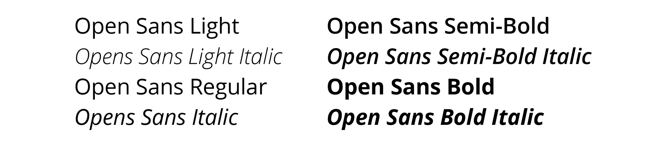
08 - OPEN SANS
Open Sans is our official typeface and is represented prominently in our brand. Its versatility, legibility, and friendliness makes it effective across both print and digital content.
To uphold the light and modern nature of Xometry’s brand principles, use Open Sans Regular and SemiBold liberally. Open Sans Bold should be used judiciously when highlighting key points or developing visual dimension and hierarchy within a body of text.

09 - Thomasnet
Thomas (Thomasnet.com), a trusted brand with a long and proud history of championing industry, is the leader in North American product sourcing, supplier selection, and digital marketing. For more than 125 years, Thomas has delivered on its mission of bringing buyers and suppliers together, providing the tools, insights, products, and services they need to inform decision-making and help companies grow.
Thomas connects highly qualified enterprise buyers and engineers, representing 93 percent of Fortune 1000 companies with more than 500,000 commercial and industrial sellers. Acquired by Xometry in December 2021, Thomas and Xometry together offer advanced support to buyers and suppliers at all stages of the manufacturing process.

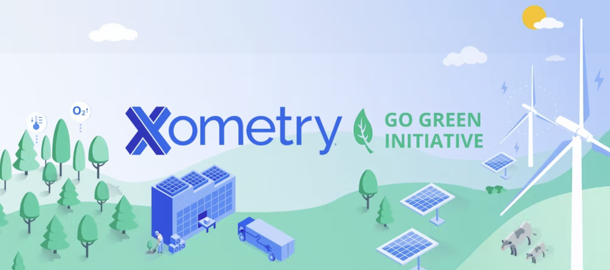
10 - Xometry go Green
Each time a package is shipped from all Xometry divisions including Xometry Supplies, Xometry Custom Manufacturing Services, and Xometry Finishing Services, Dot Neutral charges Xometry a fee, and that money is invested into an initiative to reduce or offset the emissions up to 100%. Customers also have a choice to partially or fully offset the emissions produced by fabricating their parts each time they order.
11 - Xometry Sub brands
Xometry has many different offerings and a few acquisitions that needed branding. All of our internal brands share the same structure for the logo while our acquisitions get the “A Xometry Company” tag added.


12 - CREATIVE SUITE
Xometry’s design team strives to create meaningful designs to expand our brand’s reach, obtain new customers, and share our story. Marketing collateral adheres to strict guidelines mentioned in this guide and brings a creative approach to solving marketing issues. Marketing design encompasses a wide breadth of work including, but not limited, to infographics, social media graphics, display ads, one-pagers, reports, slide decks, email templates, and website UI.