


01 - Problem:
In today’s world, personal finance is something that we all must grapple with, but at the same time, it is a perplexing and challenging topic. Cap.it.all is a mobile app that aims to de-mystify personal finance and budgeting for people of all financial backgrounds.
02 - Proposed Solution:
A complete UX process started with identifying the problem, conducting interviews, gathering research, and ending with a working prototype of a potential solution after multiple rounds of user testing.

03 - Understanding the Problem Through Secondary Research:
In 2018, the average American spent 78% of their income on expenses (American Spending Habits, Lexington Law)
Different age groups showcased other spending habits. For example, food is the highest priority for teens, while boomers tend to value the experiences of leisure travel (AARP, pipersandler.com)
Americans hit an all-time high of $930 billion in credit card debt.

04 - Competitive Research and Usability Heuristics:
To see what kind of solutions already exist, I’ve downloaded YNAB, Simplifi, and Mint to test real-world examples and gathered the strengths and weaknesses of each app.


05 - Getting in Touch with Potential Users:
I started a screener survey and narrowed interviewees down to five people with diverse financial literacy backgrounds to understand the needs and wants for a potential solution. I created an affinity map to sort out overlapping problems and spending characteristics to identify the main issue. Many people expressed that they should be more aware of their financial standings but a majority didn’t know how to get started.


06 - Empathy Mapping:
To further understand my users’ pain points and goals, I wore different hats, visualized my interviewees’ responses, and created an empathy map. I’ve discovered a few overlapping goals that I’ve decided to focus on:
Informative yet straightforward: A solution that is easy and friendly to navigate but shows the user their overall financial health in detail
Self-improvement: Whether it’s to decrease spending or save up for that next big purchase, the solution should assist you each step of the way
Education and learning: The solution should help me make better financial decisions through tips and pointers

07 - Creating Personas:
After reviewing the data from my interviews and empathy map, I created three distinct personas to represent the primary target audiences. Each persona represents a spectrum of financial literacy from the first-timer to the seasoned personal finance guru.

08 - How Might We:
I came up with a list of HMW statements based on the feedback:
How might we demystify budgeting for those that would love to get started?
How might we take multiple variables of people’s finances and give them an accurate picture of their financial health?
How might we reduce the complexity of our financial status?
How might we help users feel empowered to take control of their own financial goals?
How might we encourage non-budgeters to start budgeting?
How might we reduce the clutter of today’s products and give users a streamlined view of their current financial standing?
How might we assist users with reducing their spending in their top categories?
But the main problem boils down to this:
How might we help users feel empowered to take control of their own financial goals?

09 - Core Design Principles:
Friendly and straightforward: Users should feel comfortable taking control of their financial health.
Don’t overload: Everybody wants to be a better budgeter/saver. The design and language should inform users to make better decisions but not overwhelm them to deter learning.
Cheerleader and coach: We all want to be reassured and affirmed. The experience should make users feel good about their decisions and gently guide them if they make mistakes.
10 - User Flow and Main Red Routes:
The following structure identifies the app’s main feature that a user would use to achieve their primary goal: setting up a budget and an income stream for themselves.

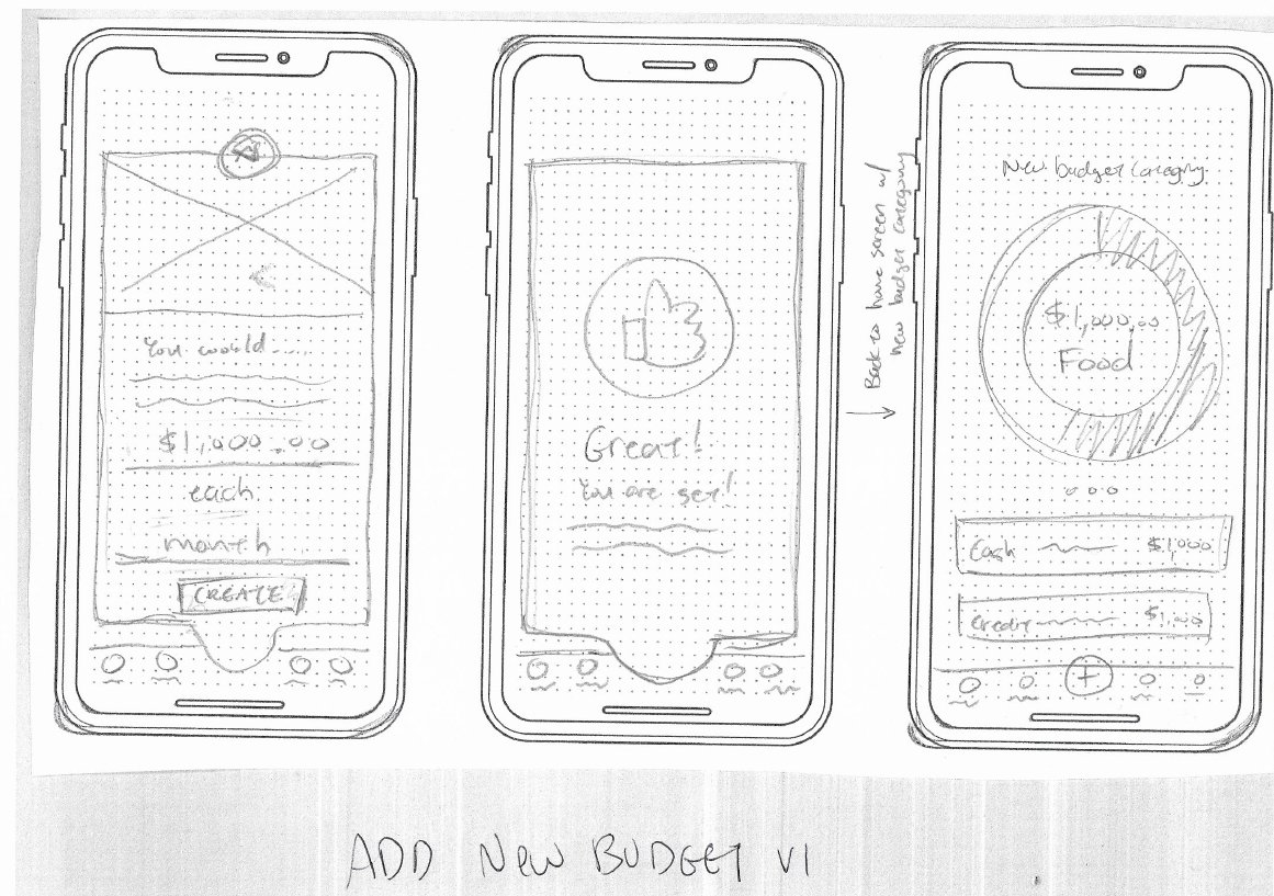
11- Sketching Potential Solutions:
I started with quick sketches to design potential solutions then garnered feedback from fellow designers to get a second opinion only my ideas. By sketching I was able to develop quick ideas and narrowed it down to the best potential solution.
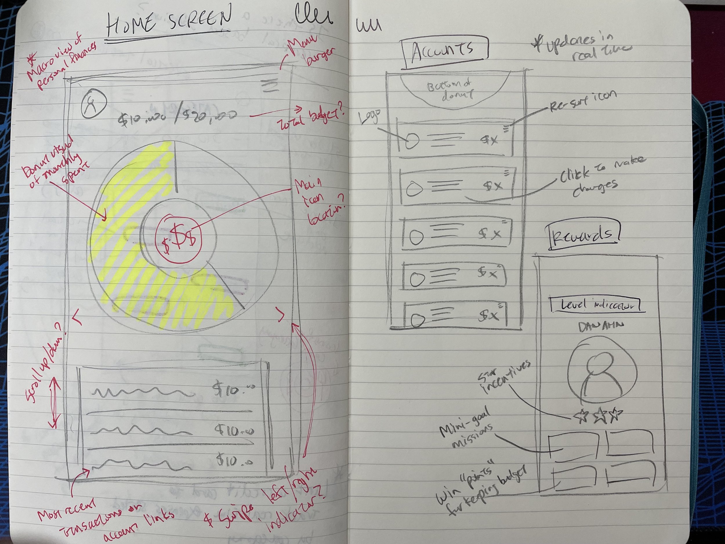

After reviewing my initial sketches with peers, I refined them into more specific designs to hone in on the budgeting piece of my app.


12 - …So What Are We Calling This? :
Every great idea needs an identity and none more important than a name. After throwing around a few ideas, I’ve officially landed on “Cap.it.all”. The name is a play on words so users can watch their financial “capital” grow as they make more intelligent decisions and “put a cap” on their spending to improve their overall fiscal health.
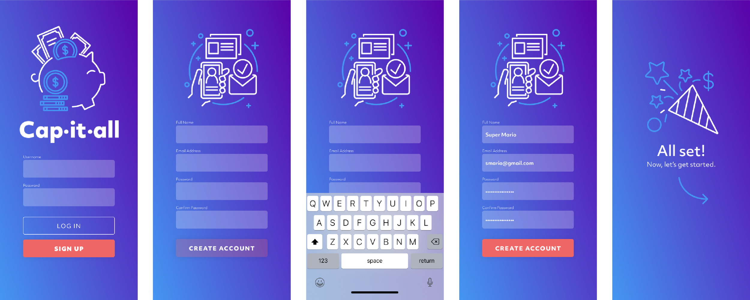
13 - Setting Up the Tone:
There are a lot of financial apps out there, but I knew that I wanted to take a different approach visually. I started gathering inspiration for the overall look and feel and decided to forego the standard “green and red” color scheme for a more “cool palette” that features a bold purple and lighter blue.


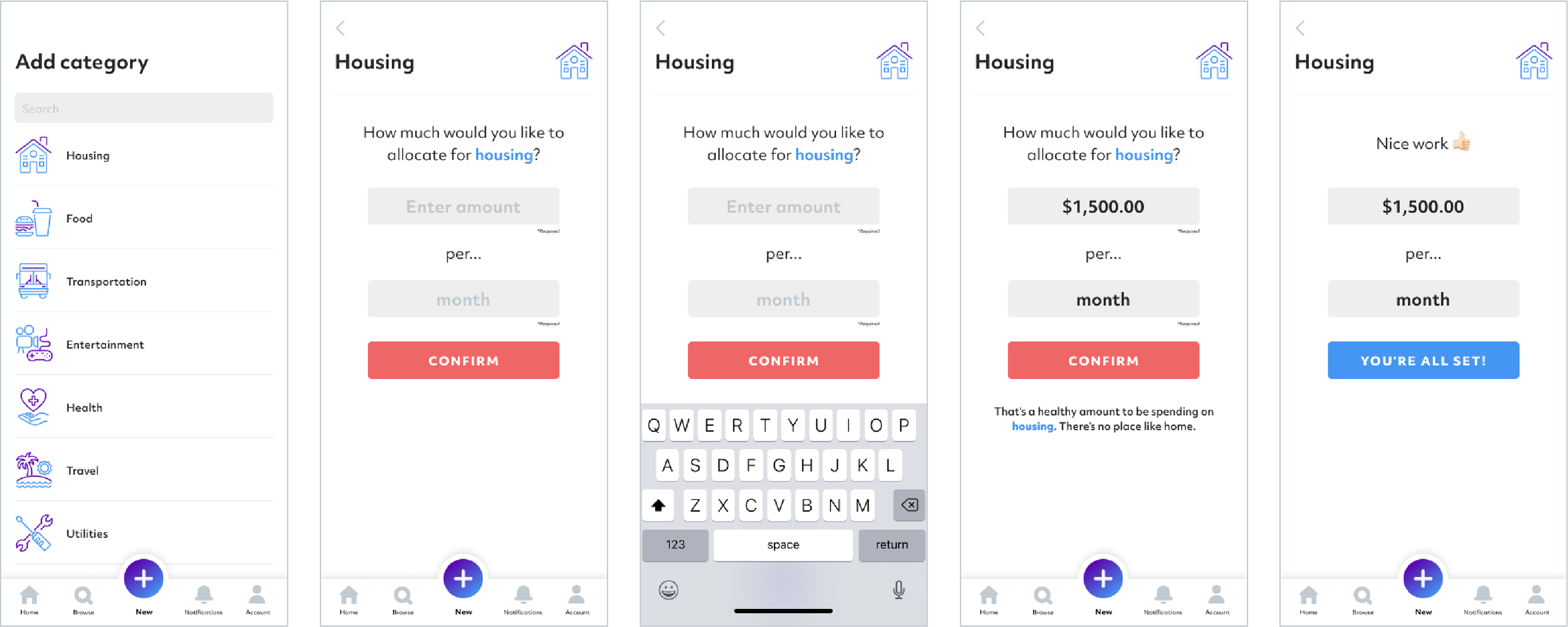
14 - Wireframing:
I created lo-fi wireframes to solidify my designs and set up a working prototype to test usability to ensure that I am sticking to my main principles of simplicity and ease of use.


15 - The First Round of Usability Testing:
I selected five random people to conduct an initial round of usability testing based on my prototypes. The main goal was to gauge if the users could create a budget without significant issues. If there were important issues, I wanted to address them before I moved on to creating higher fidelity prototypes. Overall the feedback was positive, but some glaring issues arose:
Users were unsure where to click to “create a new budget.”
Users were confused about why the popup modal appeared and why they had to interact with it in such a limiting space.
Some users commented on the hierarchy of visuals (i.e., the greeting message, the donut chart, the modal)
16 - Synthesizing the Feedback Into a Hi-Fidelity Prototype:
I took into account the significant blockers and refined my prototype into a fully functional design.


17 - Final Thoughts
I started this with an idea in mind, but the product is entirely different from what I initially envisioned. I wanted to create a solution that makes it easy for people to get a full glimpse of their financial standing and encourage people to take action to improve upon themselves. Throughout the process, the product shifted based on solid user feedback and research. Ultimately, what became of that was a concrete solution to an ongoing problem in the world today. I’ve learned many things throughout the process, but if there is one main takeaway, your initial ideas will never become the final product, and that’s okay! Each step of the process improves your design, and what ends up becoming is a product that is “more” of every category you initially had.