


01 - BACKground
In late 2022, Rhino acquired Deposify (a cash deposit collection and compliance company for landlords) to launch the rental industry’s first end-to-end deposit management system. With this acquisition, Rhino provides more than $45 billion in cash deposits and security deposit insurance for 43 million rental homes nationwide. This new product would go on to benefit everyone, from small property owners to the largest enterprise operators who want to provide strong customer service and a tech-enabled experience to make moving simpler and more efficient. With rising inflation and living costs, Rhino aims to address the most pressing needs of renters and landlords alike.
02 - The Problem
Acquiring the technology is one thing, but implementing it is another. Because Rhino had to roll out the new features as quickly as possible, the interim solution was to embed the Deposify experience as an iFrame within Portal, Rhino’s SaaS for property managers. While this solved the deposit management problem, the iFrame format did not service our landlord users effectively.
The Deposify iFrame made the feature “functional” but it was in reality a barebones solution that caused more headaches than solutions.
03 - Empathizing with the user’s needs
Note: I know in the tech world, “PM” usually refers to “product managers,” but at Rhino, “PM” refers to our “property managers,” aka our B2B clients.
To better understand and validate the numerous support tickets that came in, I decided to talk directly with my property managers (PMs).
The main goal of my research was to identify the unmet needs that PMs were facing when using the iFrame iteration.
I collaborated with our partner success team to set up three new calls and sat in on one recurring weekly meeting with one of our largest partners. While individual partners had specific issues, all of them had similar pain points that are summarized below:
Whether they’re a small property owner or a national enterprise, they all manage thousands of deposits, and the current iFrame has no search or sort functionality, so PMs are manually scrolling to find each renter.
The UI doesn’t provide pertinent information at first glance. PMs have to “click into” each card to obtain more information, and even then, they don’t get everything in one place.
While you can manage your deposits, it is nearly impossible to see where the money is being routed because the bank setup process is convoluted and prone to bugs.
04: How might we…actually get this thing to work properly…
During a brainstorming session, my product manager and I came up with a list of “How might we” statements to tackle the main pain points of the users. The following two statements became our focus:
How might we…make the deposits page more user-friendly in scale?
How might we…redesign the UI to be more productive and functional?
05 - IDeating Deposify as a Rhino-built product
The biggest problem was the UI. There was a lot of information that had to be visible to the PM, but the current iFrame hid all of that in a drawer. To solve this problem, I came up with a table wireframe that housed all relevant data for each renter and their deposit statuses.
The main idea was to create a familiar Portal experience that our PMs were comfortable with. A responsive table view would allow multiple columns of data to be shown simultaneously while keeping everything neat and organized. Each row would be able to be clicked, which would open a “details panel” that featured all the information that a PM would need to review. However, after consulting with stakeholders on how much relevant data needed to be shown, I quickly ran into another problem.
This table is getting out of hand…
Live data on end user screen resolutions
The table grew out of proportion with all the information that needed to be displayed. I connected with our data team to pull information on how many different screen sizes our PMs use. A vast majority were on 16:9 monitors, but a handful were on smaller widescreens and a few on 4:3 ratios. Even on a 16:9, the sheer number of columns would cause a lot of truncating text, which defeats the purpose of the table view.
06 - A new solution
To solve this, I went back to our partner success team to find out how PMs use this data. What I discovered is that while all the PMs would like to have all this information, no two needed the same columns for their day-to-day usage. This gave me the idea of a "customizable table.”
Customizable table columns
The ability to customize the columns allowed each unique partner to tailor their table view to best serve their function. It also solved the problem where there were too many columns to make this table legible. I did a quick gut check with the same partners I've talked to, and the response was positive.
07 - putting it all together
Due to time constraints and the need to ship this feature ASAP, I reviewed the main wireframes with my engineering manager and product manager to set the scope before we put this project into the next sprint. I’ve also garnered additional feedback from the partner success team on how to improve upon the preliminary designs. These were the main changes that were made going into the hi-fidelity phase:
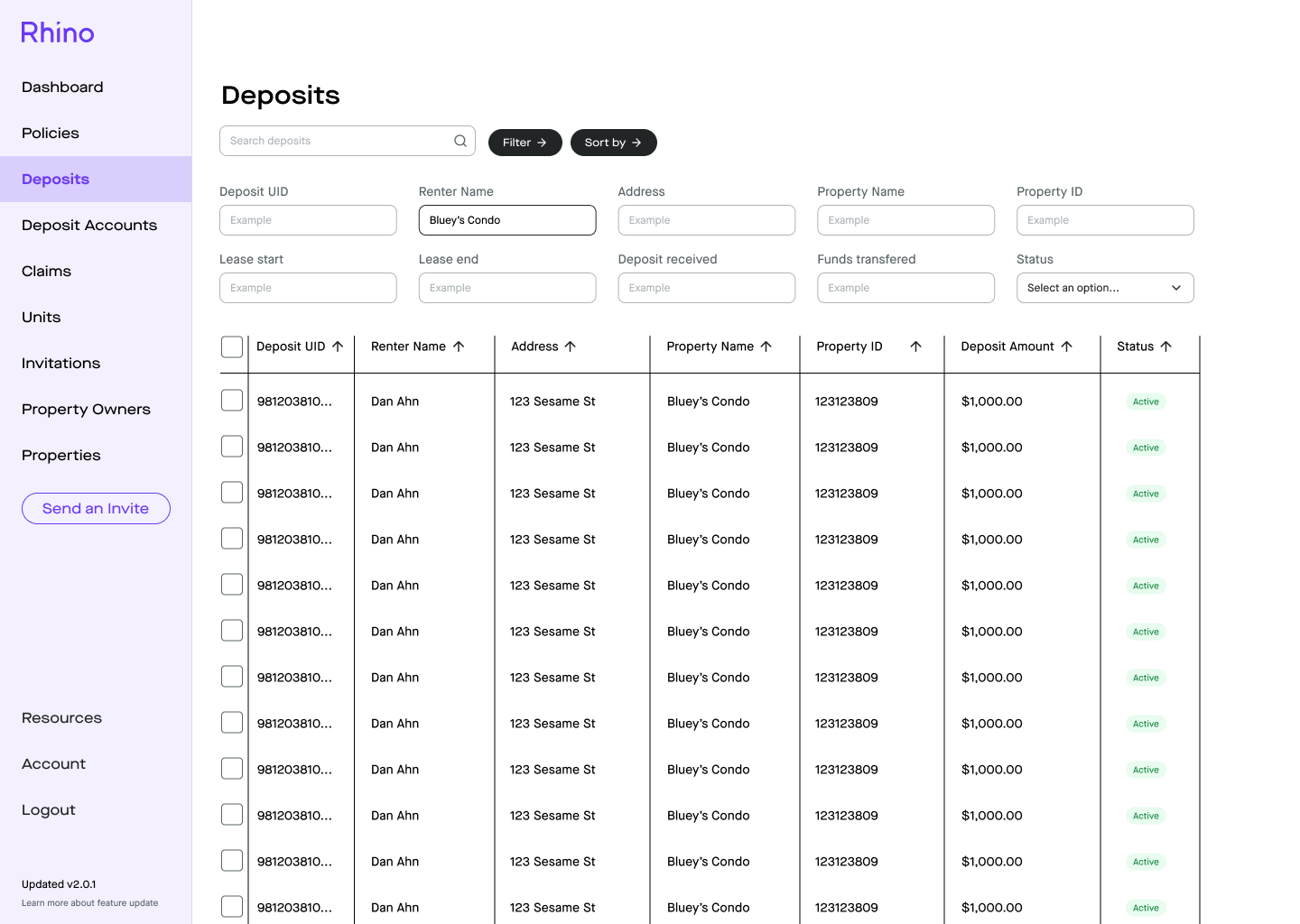
The filters should always be visible. There isn’t a reason to click the “filter button” to bring up the categories. PMs are often in a time crunch, and they need to be able to search and sort based on different criteria (i.e., which renters have leases that are expiring on a certain date).
The “search bar” was not necessary once all the filter categories were visible.
PMs need the ability to bulk select and take action to 1) close deposits and 2) withdraw cash.
Final table view with the filters always present
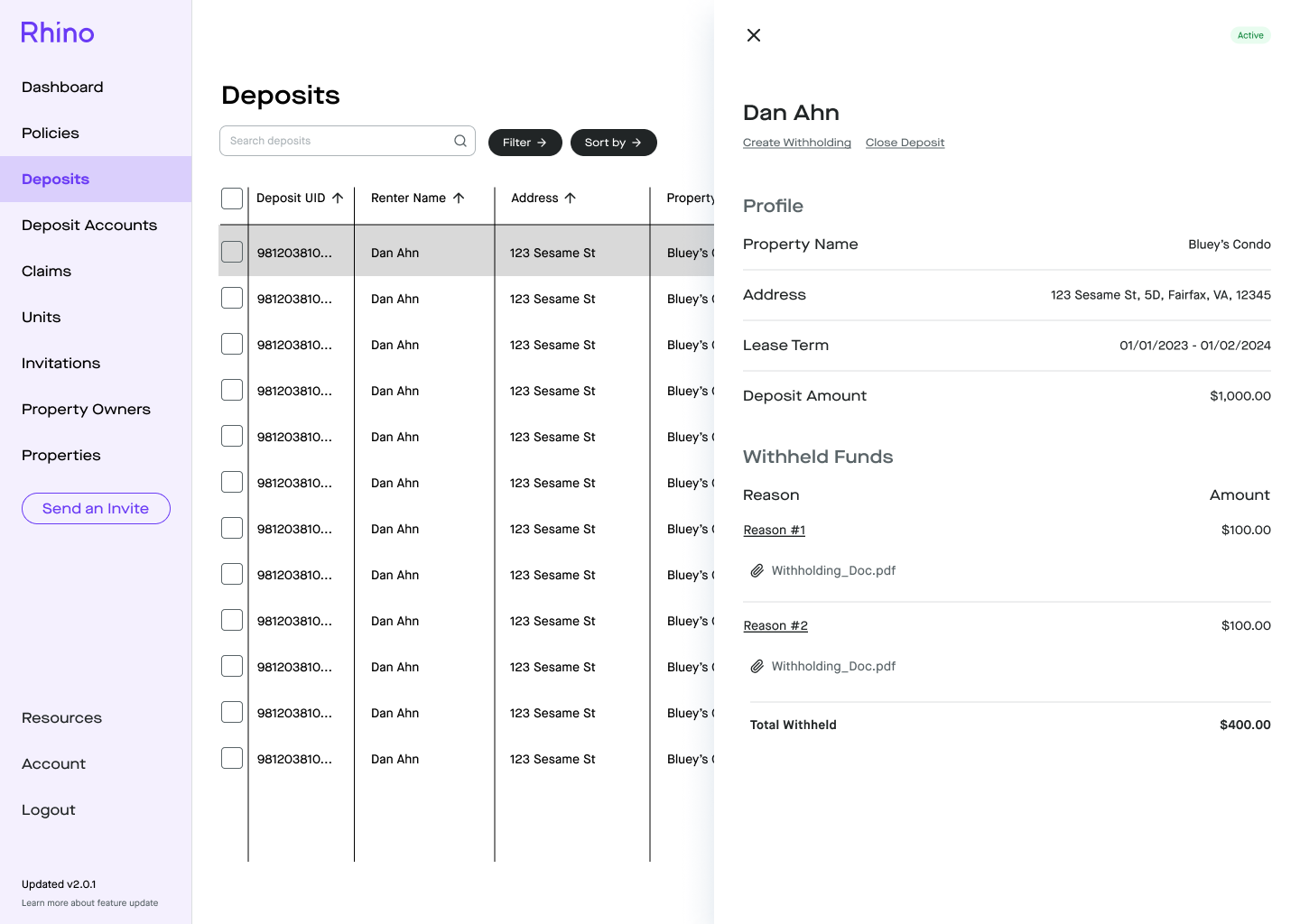
Details panel with all of the renter’s information and ability to create withholdings and close deposit
Bulk actions
08 - A nice-to-have becomes a need-to-have
Unfortunately, we hit a snag on the road when one of our engineers discovered that creating this new experience would effectively eliminate the ability to create withholdings. The withholdings feature was a nice-to-have because the original technical design was going to leverage the existing experience that was in the iFrame, and we would update it as a fast follow. However, further testing revealed that the new build coded in native rails would not support the legacy Deposify code base, which was done in React. This delayed our timeline, and I hopped right into creating a withholding experience based on the new table design.
The new create withholding experience
After creating a withholding, the PM will confirm the breakdown of cash that’ll go to the renter and themselves
Successfully created a withholding and closed out this deposit
Time-wise, we had to add about a week’s worth of build time on top of what we had originally scoped out. This was agreed upon with all stakeholders, as this withholding experience was a key factor in the core functionality of managing deposits.
09 - Next Steps
The MVP has been scoped and refined and is currently undergoing development. As mentioned before, we have a list of fast-follow items that were on the nice-to-have list. I will start tackling those experiences soon. As quickly as this project needed to be shipped, if I were to do it again, I would take greater care to ensure that I was perfectly in sync with my engineering team and product manager. While we did hit all the acceptance criteria, the late discovery of the withholdings snag is something we talked through in our retro. Still, the MVP is something that our partners are eagerly waiting for, and I hope to add additional features to make this as seamless as possible.