


01 - THE PROBLEM
Rhino’s core mission is to make housing more affordable by reimagining the security deposit. The core product created a way for renters and partners to benefit from Rhino’s SDI (Security Deposit Insurance). However, there has been ongoing feedback about the longstanding friction in the Rhino experience. While renters and partners are able to have one platform to tackle move-in and move-out logistics, that experience has shown its age. As Rhino changes economic terms to be more favorable to Rhino, the value that accrued to the partner and renter now accrues to Rhino. Thus, existing product friction is no longer tolerable. There is evidence of this in Rhino’s declining invitation rate and application rate as partners silently churn and lower their usage of Rhino.
02 - Breaking down the problem with Discovery
Rhino has a unique problem—the product experience causes a lot of friction, but there is a near 100% adaptation rate. This is because the product is a key step for property managers (PMs) to either a) collect a standard cash security deposit or b) invite renters to sign up for Rhino’s Security Deposit Insurance (SDI) policy. Renters who qualify are invited to sign up for Rhino and must complete it as part of their move-in process to start a lease.
The adaptation rate is great, but because the experience itself has been described as “a tedious, confusing process," it’s almost like the renter’s hands are forced. This resulted in a -30 NPS score from renters, who oftentimes begrudgingly have to complete the process to meet their move-in requirements. To summarize, the top-line issues with the existing experience were as follows:
1 in 5 renters churned
1 in 10 renters encountered a flow-breaking bug
Support tickets up 350%
Partners’ confidence level tanked
More detractors vs. promoters resulting a sharp decline in NPS score


Yikes!
Because of insurance legalities, Rhino’s application process has to ask a ton of questions to be able to determine eligibility, and this creates a long, convoluted process for the renter. On average, a new user would get through the entire process in about 10–15 minutes. However, our Fullstory data often showed users going beyond the 15-minute mark (upwards of 20+ minutes). This is mainly caused by two issues:
Ongoing optimization issues on the back end result in longer wait times as the APIs sync to pull data.
Broken UI elements on the front end that make it physically difficult for users to get through the funnel
This was further justified when we held discovery calls with our partner success and customer support teams. They reported a noticeable MoM increase in support tickets, negative reviews, and more questions being thrown around on social media. To summarize all of it, we created new user stories about what the new product experience should entail.
As a renter, I want to be able to sign up for Rhino or pay my security deposit in a streamlined experience so that I can move in quicker.
As a PM, I want a single, unified place where I can have my renters fulfill all their move-in requirements so that I can ease the manual load on my teams.
We also talked with our actual users to understand their pain points directly. We knew the main problem for renters, but we also wanted our new product to address concerns our PMs have. We asked PMs to walkthrough their step-by-step process of using Rhino, and often times we would witness the sheer amount of data they have to process in order to have Rhino integrated properly.

Partner discovery call
03 - REthinking a core product
The problem is that a lot of the functionality of our core product is tied to user data, which has to be obtained one way or another. This is where Yardi, a property management software (PMS), comes in. The team discovered that a vast majority (65%+) of our PMs use Yardi as their main PMS. Yardi stores all the renter data, and if we were able to get our system to integrate with it, it would eliminate a number of steps needed for both renters and PMs.
Our engineering team deduced that a user would only need to provide four pieces of information (name, email, phone number, and SSN) for Rhino to be able to pull all applicable renter data from Yardi. With that information, we created a new, streamlined flow based on the information available.

04 - THE Solution
Rhino has an opportunity to integrate its product experience more deeply with the Yardi platform, a system that their partners are already accustomed to and work out of every day, to improve adoption of and engagement with Rhino. With this new product, Rhino will be able to streamline the experience for both renters and partners.
05 - Roadmap to September Launch
While the engineering team mapped out their sprints to get the back end functional, I put together my own roadmap to get the design ready for launch. I worked with engineers directly across all 3 of Rhino’s pods to ensure my design would meet all technical requirements and create synchronous checkpoints to ensure smooth sailing towards our MVP launch plan.

06 - Design and product strategy
This was a unique project where two different user groups needed to be accounted for: our partners wanted a single place where they could handle all of the onboarding for a renter, and the renters needed a quick and seamless experience to be able to fulfill all of their move-in requirements. There were some overlaps in user needs, but at the core of it, I had to think about how this experience could reduce friction and minimize time for both parties. At the same time, our engineers were exploring how we could utilize the data in Yardi to automate most of this.

07 - Competitive analysis (or why do I constantly check my home’s price on opendoor?)
I researched a few sites that had similar onboarding experiences, but I highlighted the features I liked about these top three sites:
Turbotax: Present a complicated topic to me, like I’m a 5th grader, in a good way. Taxation in and of itself is a complicated and often convoluted topic for the average person. I’ve been a Turbotax user for about a decade now, and with each new release, they make it easier to complete my tax return. They explain topics and words using common language and do not speak as if I were a finance professional.
OpenDoor: The batched input experience allows users to focus on similar topics. In early 2022, I was in the market to sell my house, and I found that OpenDoor’s funnel experience was more user-friendly than that of other iBuyers. The main point was the grouping of similar inputs (i.e., specs of the house) together on a screen so the user doesn’t have to thought-switch between different topics.
Jetty: Talk to me like I’m a human. Jetty is a direct competitor of Rhino, and what they did better was treat the user like an actual person through their content. They display headings and information like a casual conversation, whereas at Rhino, we were very stoic and systematic. The subtle change in UX writing creates more empathy and connection with the user.

08 - Applying learnings through exploratory design
I took to pencil and paper to quickly sketch out a few ideas keeping in mind both the product and business goals. I wanted to design an experience that was similar to our user base but also refreshed enough to be considered a net new product.

I presented my options to the greater team, then consolidated the top 3 designs into a wireframe. Out of the three designs, we chose to move forward with the one that minimized all distraction with clearly labeled instructions so that the renters could breeze through the funnel with a targeted focus.


09 - Streamlined Ideating (Thanks, habitat!)
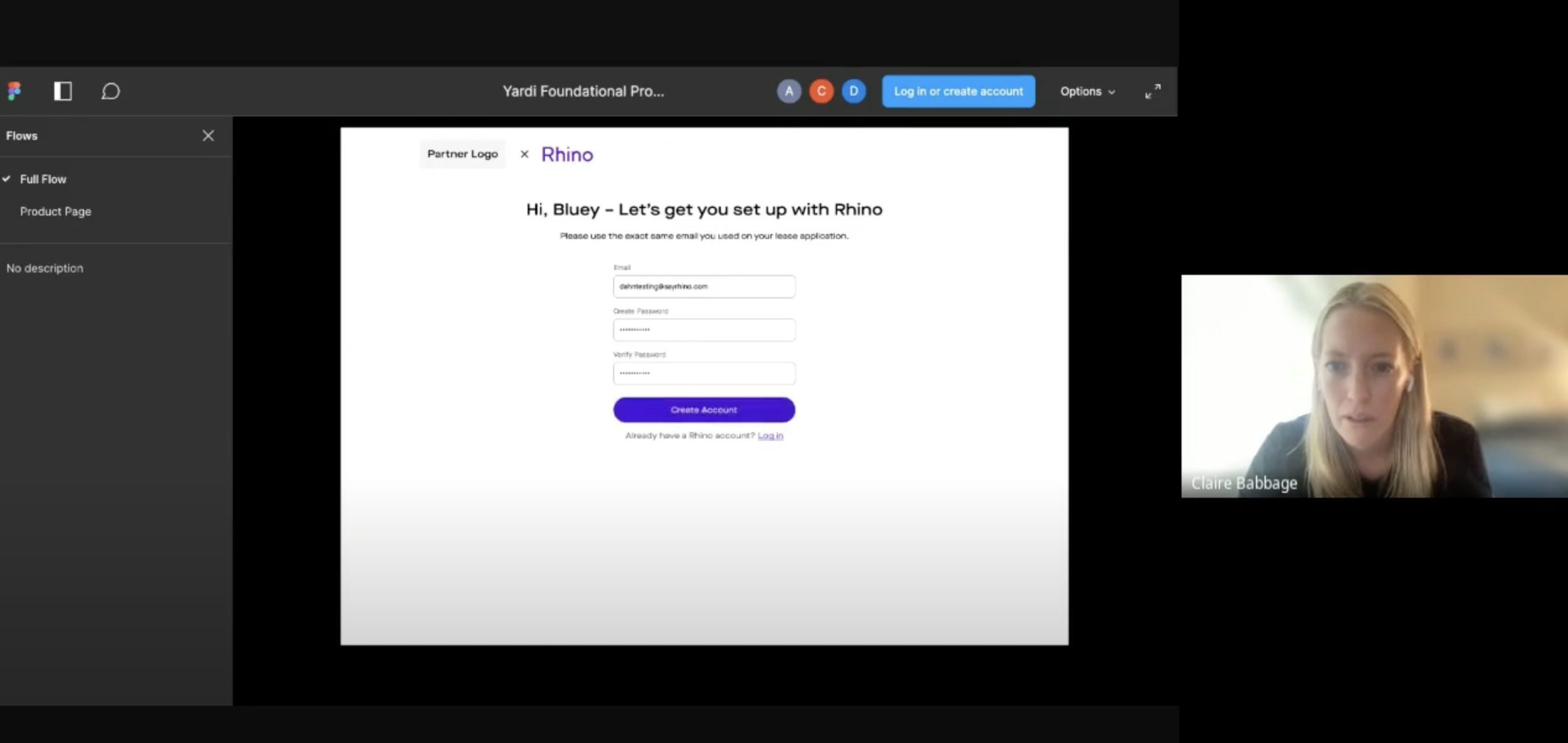
Because I had already started working on a component library to rebuild Rhino’s design system (Habitat), I was able to put together quick, hi-fidelity iterations. My main focus was to eliminate as many steps as possible to ease the friction our renters experience today. The first part was the sign-up funnel, which now featured only four inputs and a verification step so that our system could pull data from Yardi.

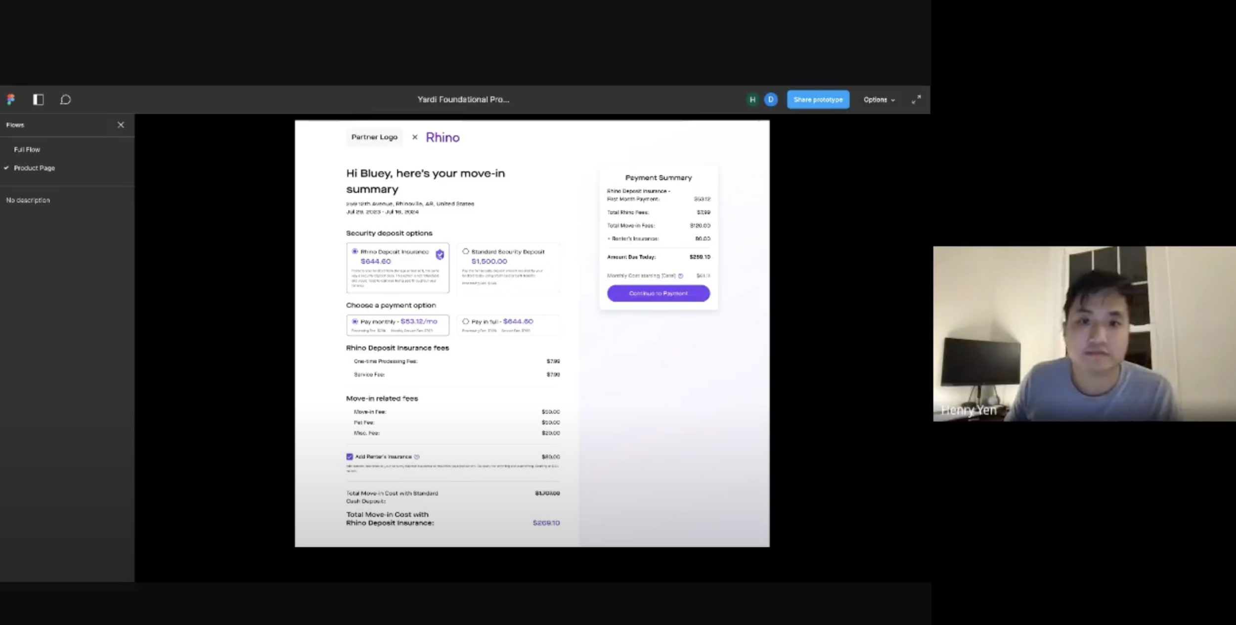
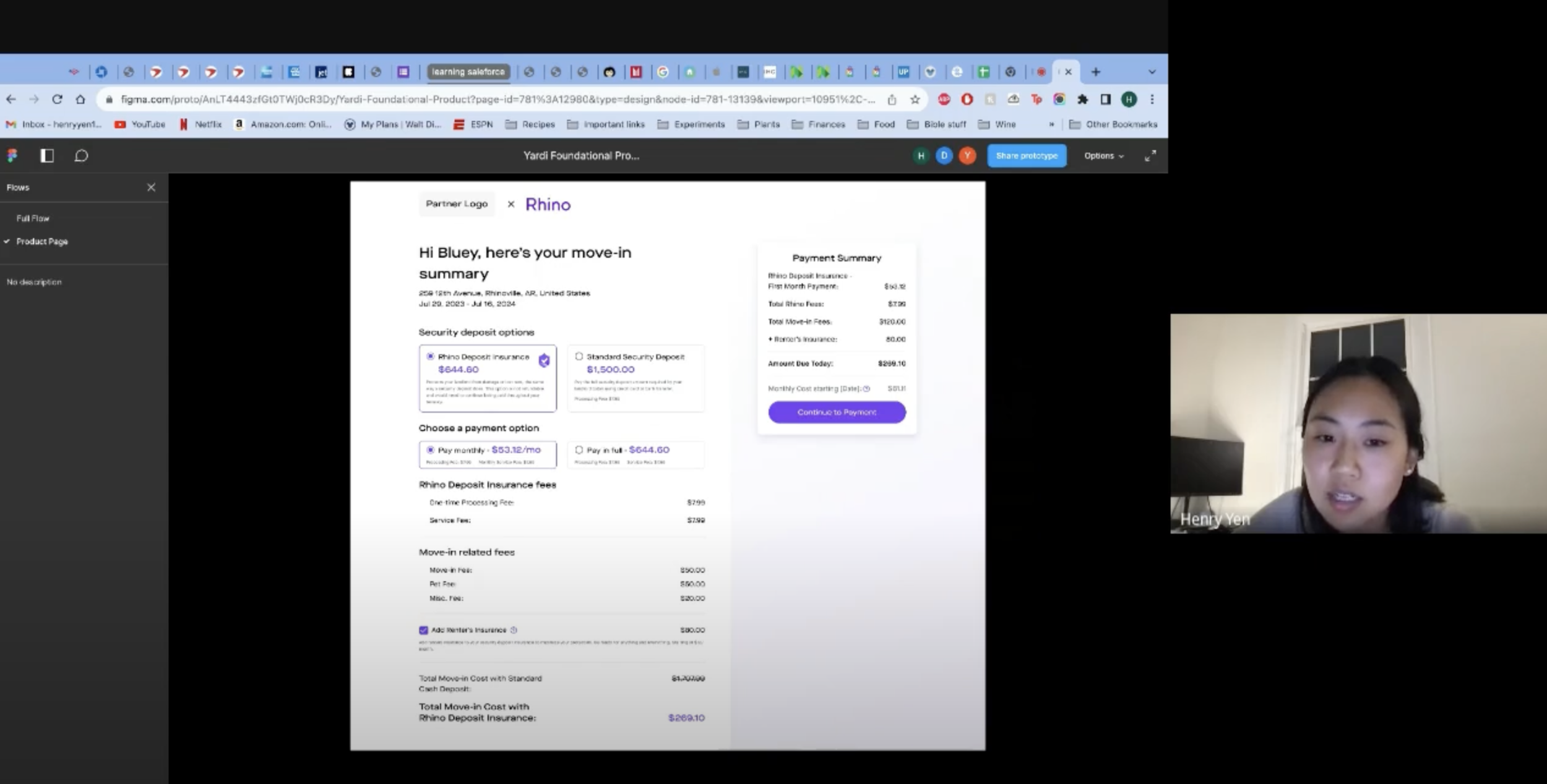
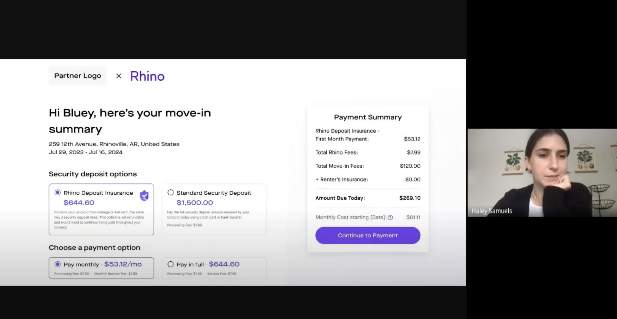
After the data was pulled, the new summary page detailed everything about a renter’s move-in cost and what Rhino products they were eligible for.

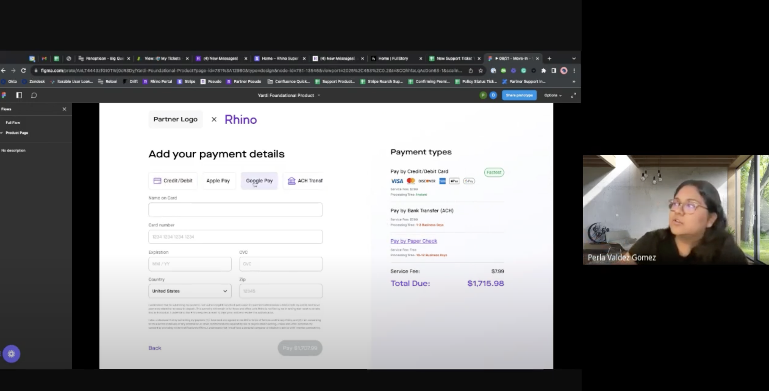
Once a renter selects a security deposit option, we will bring them to our newly integrated Stripe Payment experience to complete the checkout.

10 - Gut check (aka this is why we review early)
I shared my main design with the greater team and gathered valuable feedback that would lead to five more iterations. I’ve listed some of the key highlights from the review sessions.

Move-In Summary Updates:
Renters should know exactly how much they need to pay to fulfill their move-in requirements.
Renters should be given the choice to pay for SDI in full or on a monthly basis.
Business opportunity to upsell Rhino’s renters insurance
Consolidate the itemization and payment summary on one screen.

Checkout Updates:
Renters should be given multiple forms of payment.
New Stripe Payments will launch simultaneously, so we need to incorporate that UI.
11 - Technical and Legal SnAgs
In an ideal world, everything you plan out and roadmap out goes into development smoothly. Unfortunately, midway through our development, our engineering team discovered that Yardi cannot in fact pull all of the information we need, so that required a redesign of the sign-up funnel to incorporate additional fields. Another factor was the SSN aspect. Because Rhino dabbles in insurance, there were more compliance pieces that needed to be met in order to launch our new product. This involved adding more legal language throughout the experience. These were non-negotiable factors that had to be taken into account.

To meet the technical and legal requirements, a screen had to be added with the additional pieces of information. Unlike our existing funnel, I opted to bucket the inputs into two separate screens vs. one screen per question. Bucketing all the inputs into one screen was not an option because there were pieces of data that needed to be collected before the Yardi integration for the data to return properly. The sign-up funnel expanded in screen count, but we still ensured that the experience was less taxing.

Verification stages got their own screens and existing user login flow got the pop up modal treatment
12 - Business needs come knocking and a dark pattern rises
One of the core reasons why Rhino pivoted into this new, streamlined experience was because this was a catalyst for their short-term strategic plan to achieve profitability by late 2024. One of the underlying business pain points that has plagued Rhino is security deposits being paid by a standard paper check. While not a popular option, there have been cases where renters pay their deposit via check, and it’s become a lose-lose-lose situation for all parties.
Rhino loses money per paper check transaction.
Renters’ move-in times get delayed because of the amount of time needed to process a check (10–14 business days on average).
PMs have more money tied up in “processing” and cannot immediately reinvest that cash in other places.
While you must legally offer the paper check option, you can make it more subtle. I designed a new flow to educate users on the implications of paying a deposit via check.

Added an additional step to ensure that renters who choose this route understand that there could be unintended consequences
13 - VAlidating the design
Once the hi-fidelity design was in a good place, I put together a fully functional prototype so I could start validating my design choices with users. The prototype also served as a checkpoint for the engineering team. I made it as close to MVP as possible to show the developers what the front-end patterns would look like. Although the number of screens grew, I believe it still kept to the main goal of streamlining the experience as much as possible.

The full flow of the Yardi-Native experience
I ran six user tests with three internal and three external candidates. I chose to include three Rhino employees on the Partner Success team in my testing plan to get a holistic review of the new product experience. All user tests were moderated by me, with four prompts for each participant to work through.
All six participants were able to get through the prompts with minimal difficulty. An interesting note is that 4/6 participants found it somewhat difficult to pay their security deposit via paper check. In the end, they were able to complete that particular prompt, but this was one of the rare cases where a user having difficulty completing a task is a successful metric (re: our business goals).
Here’s a summary of the top feedback that impacted the final design for our MVP:
“I like that the move-in summary page is very detailed about what I need to pay, but I think it’s difficult to see what my monthly payment would be if I were to decide on a monthly [SDI] policy.”.
I added a Monthly Summary card in the UI to display what the renter is responsible for after this checkout.
“I would like to see more information about Renter’s Insurance and maybe even the [SDI] product.”.
Tooltip patterns were added with more details on each of the products.
“What if I had questions during this process? Because this is about insurance, there’s a few things on here that I’m not too clear on.”.
I added a link to the FAQs and Contact Us landing pages (later removed for the MVP launch). Backlogged to V2)
“How do I know what the password requirements are?”
Added helper text to the PW input
14: Mobile Always
As I designed the desktop version, I simultaneously designed the mobile experience. 80% of our renters sign up via mobile, so it was critical that the experience be just as seamless.

15 - Launch that MVP!
After synthesizing all my findings from the user tests, I shared them with the greater team. Most of the feedback was incorporated into the MVP launch plan, save for the links that would click out for contact information and FAQs. Below is the final design and prototype that were handed off to the developers for final build.


16 - One month later…
After the MVP launch, we reviewed metrics on the new experience’s performance.

The obvious learning from the initial launch was that the backend could not match renter data when multiple first and/or last names were in a field (i.e., Jose Maria). This caused an estimated ~80% churn rate for those users who fell into this unique category.
After reviewing the data, the team got together to brainstorm potential solutions. What we found was that ~98% of renters had an email address, and Yardi could pull together all the required data through this single PII. We followed up the launch with a V2 of the leasing integration experience that featured a single PII input (email), and if the back end matched the data, we also implemented pre-populated fields to further expedite the process. After V2 was launched, our results were positive:
The churn rate dropped from 20% to 3%.
ZERO flow-breaking bugs (so far, knock on wood!)
Average end-to-end time for renters is down to ~5 minutes (from 13 minutes with the legacy product).

17 - Future
The next step for this product is rethinking the product summary page to draw more conversions to SDI. These are a few hi-fidelity designs I created before my time at Rhino came to an end. I’m extremely proud of this project and thankful to have worked with an amazing team of engineers, product managers, and account managers to ship a net-new, first-in-the-industry, renter onboarding product in 2.5 months. I look forward to Rhino’s continued success through the leasing integration experience.
